The scope
The scope
InfluencerAds is a start up marketing agency that is motivated to bring about change. They identified that smaller influencers are unable to get rewarded for the amazing content that they create, that the cost of online advertising has risen too high for small businesses to remain profitable and that the advertising industry's name has become tainted over time. They are motivated to fix all of these problems by seeking to connect small businesses with influencers, and raising money for charities that matter to their users, they believe that they can make a difference.
The work created for the start up company, InfluencerAds, was completed over 15 weeks as part of an internship during the summer of 2020. InfluencerAds employed me to fufill the job title of 'graphic designer' to create graphics, videos and UI/UX mockups for their website, as well as their mobile app and social media accounts.
Each week we had a series of virtual meetings to see how everyone within the business was progressing. At the end of each week we would perform a demonstration of the work we had completed, which would be critiqued by all all InfluencerAds employees.
Week 1 - Website graphics
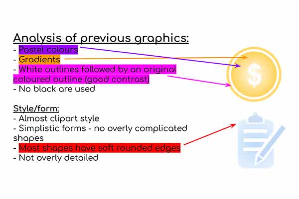
The company wanted a new take on their previously used graphics for their website. They stated that they wanted to keep the same colour scheme as well as the same style of the old graphics, but to change the form of the graphcis.
I went ahead and analysed the key elements of previously used graphics to identify the style, form and colour scheme.
You can see an example of this to the left.
Graphic ideation - Spider diagram
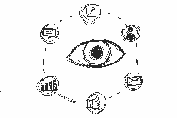
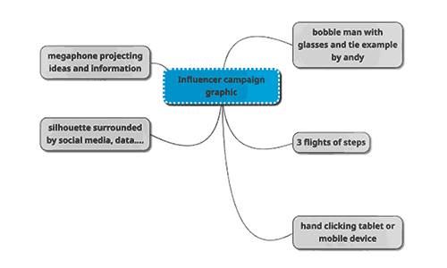
For each of the 4 graphics I decided to create a spider diagram, this way I could jot down many different ideas related to that graphic. Each of the 4 graphics will be displayed on the website on different pages. I tried to generate ideas that I thought would represent that graphic the best. I also used this method of genertaing ideas through out the internship. You can see the examples of the spider-diagrams for this task below.
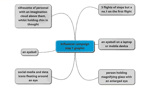
The scope
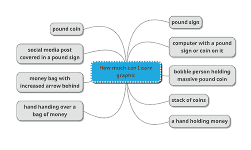
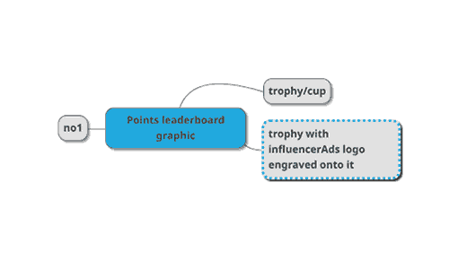
The scope
Graphic ideation - Moodboard
Just like with the spider-diagrams moodboards are a way of generating ideas, but as a visual representation. Moodboards are a collection of images that represent an idea and in this case the mooboards are presentations of the spider-diagram graphic ideas above.

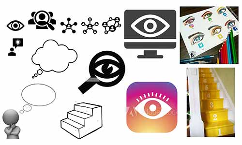
The scope


The scope
Graphic sketches
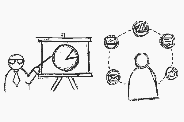
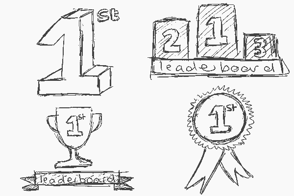
After gathering relevant materials and references from both the moodboard as well as spider-diagrams I was ready to start sketching ideas. The general manager of InfluencerAds, Andy Tillot, specified he wanted a man pointing at a board for one of the sketches. I completed this sketch along with other sketches I thought would best represent each representation. (The graphics ideation process I have used from the spider-diagram to the sketches is the same process I haved use through out the project, apart from the tasks that already provided material.)
The scope
Colour palettes
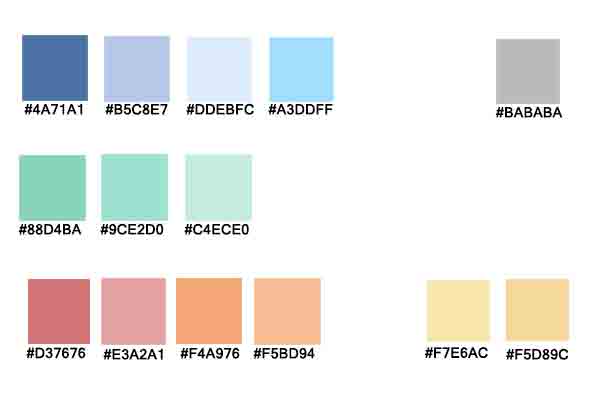
Andy specificed that he wanted to keep the same colour scheme from the previous graphics, but to slightly extend the colour range.
So, what I did was use the colour picker tool in Adobe Illustrator on the previous graphics to extract what the hex codes were as well as the colour example.
From this I made a reference colour sheet with all the old and new pastel colours ready to be used for new designs. This colour sheet was sent out to all other graphic designers to use as a reference.
Sketches & colour palette feedback
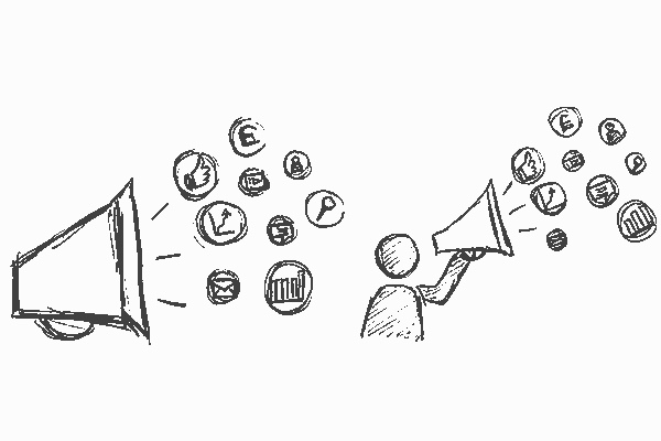
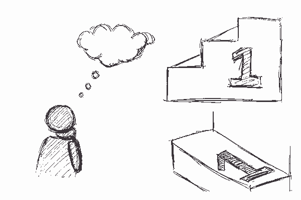
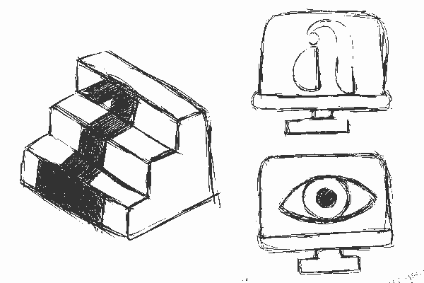
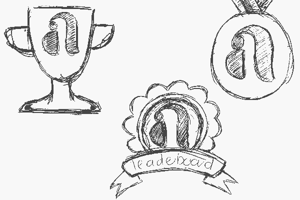
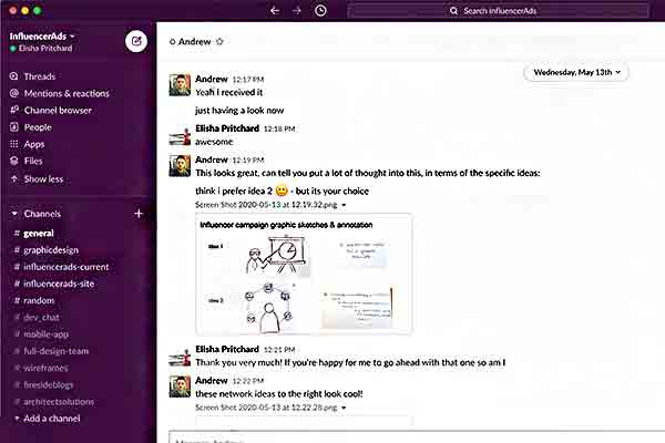
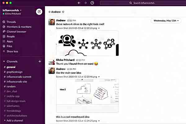
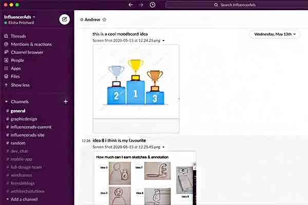
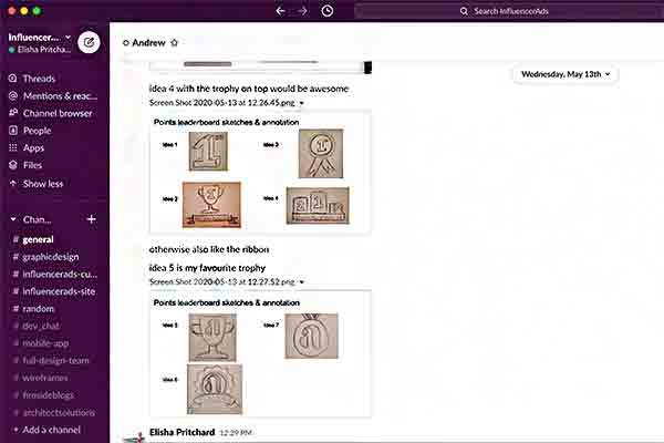
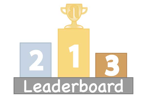
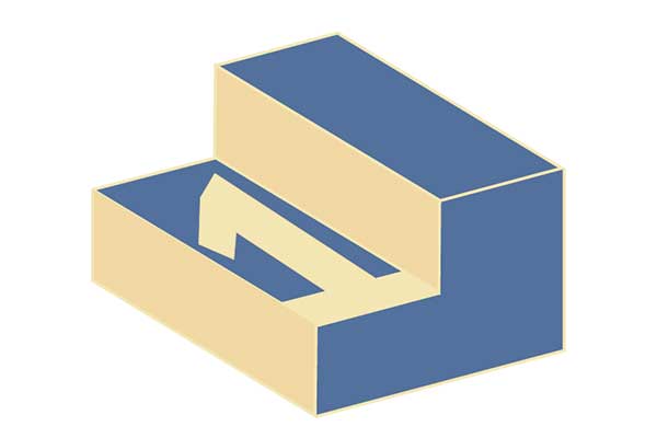
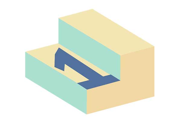
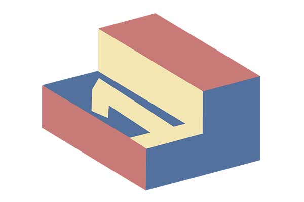
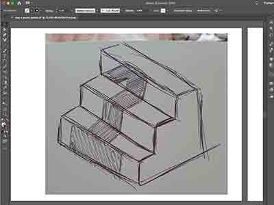
Once I had completed the intial sketches for each graphic as well as the colour palette, I sent over what I had done to Andy to get his advice on which graphics would be best to take forward into the development stage. For the 'influencer campaign' graphic he thought that sketch 2 would be best suited, for the ''step 1' graphic he liked the stair case idea, for the 'how much can I earn' graphic Andy preferred idea 8 and for the 'points leaderboard' graphic Andy wanted me to merge idea 4 and together.
The scope
Graphic development
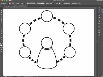
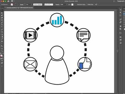
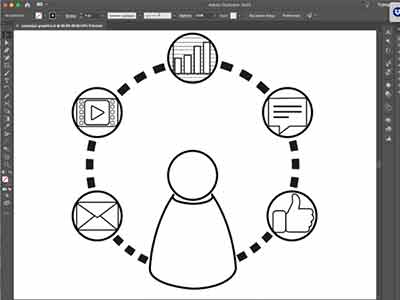
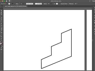
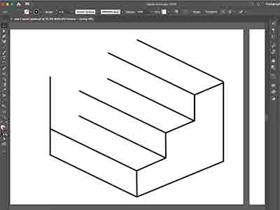
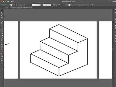
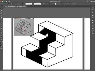
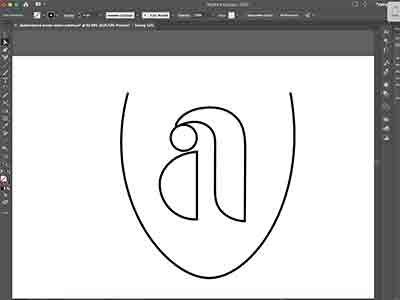
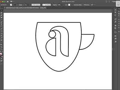
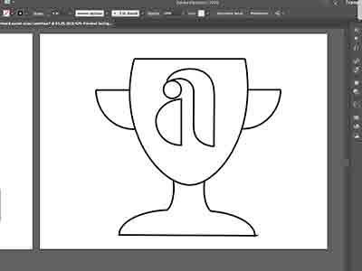
After collaborating on the final design of the graphics, I imported my sketches into Adobe Illustrator, I was ready to create my design in a digital format. For each of the 4 graphics below I have taken screenshots throughout when developing them to display how I created them.
Influencer campaign graphic
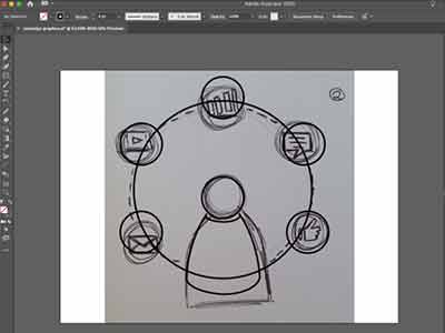
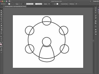
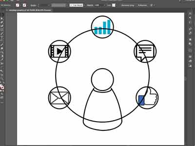
The scope
The scope
Step 1 graphic
The scope
The scope
How much can I earn graphic
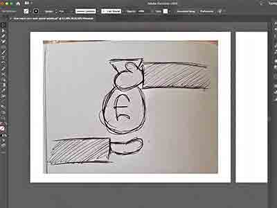
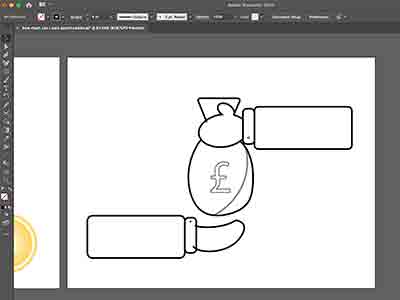
The scope
Pointleaderboard graphic
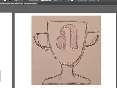
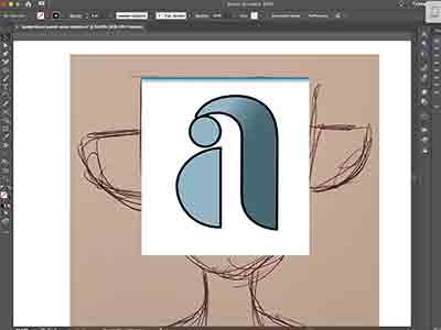
The scope
The scope
Chosen final designs
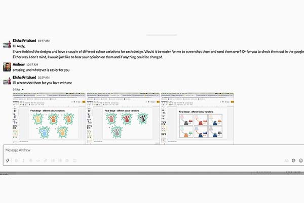
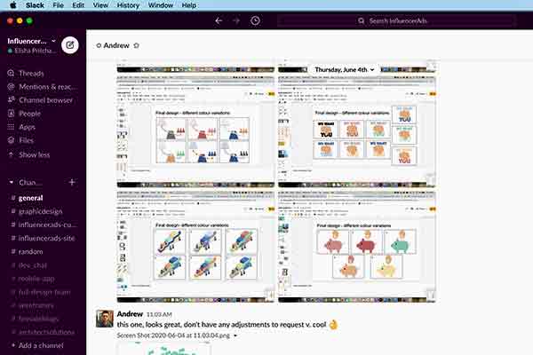
The final designs are displayed in the carousel below. They have all been transformed from just basic vector line art to finished designs by adding colour, shadows and gradients. In some cases there are multiple colour variations for some designs. This was because I wanted a variety of colour variations so that the InfluencerAds manager had the option to chose from a selection
The scope
Task 2 (week 2) - Website graphics

Week 2 was a very similar tasks to the previous week, the aim was to create 4 graphics to match the message and image references Andy gave me. (An example of the image references is dislayed to the left.)
graphic 1 “Make a post on Instagram, and send us the link. So in total, that was probably twenty minutes work and you could make hundreds or thousands a day!”
Graphic 2 “We care about the quality of the content, not the number of followers.”
Graphic 3 “Businesses are seeing results.”
Graphic 4 “Your budget is in your hands.”
Graphic ideation
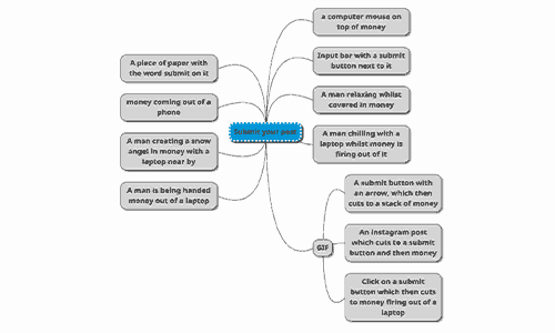
Spider diagrams
Like last time, I decided to create a spider diagram for each of the 4 graphics, each of the 4 graphics will be displayed on the website on different pages. I tried to generate ideas that I thought would represent the graphic the best.
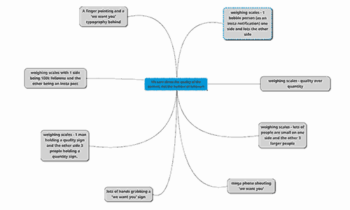
The scope
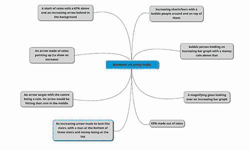
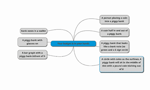
The scope
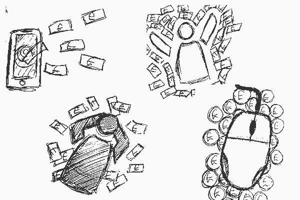
Moodboard
Again like last time I tried to create mooboards that were representations of the spider-diagram graphic ideas above.
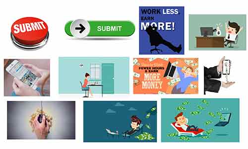

The scope

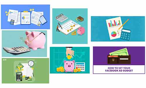
The scope
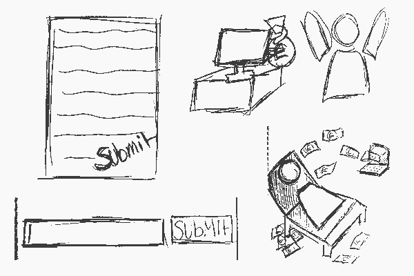
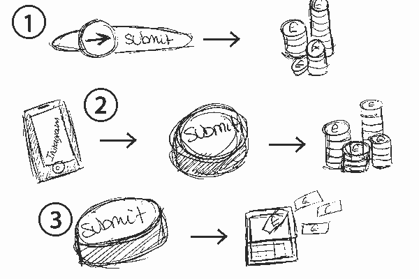
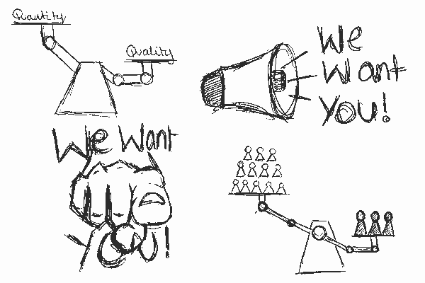
Graphic sketches
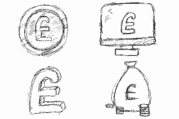
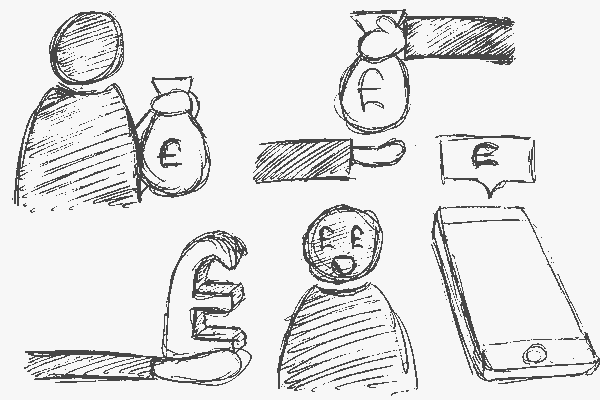
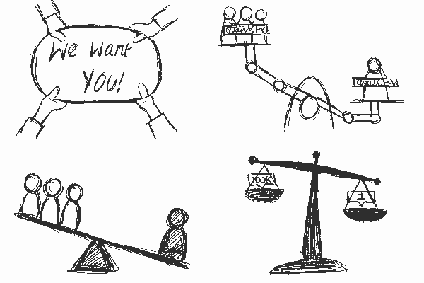
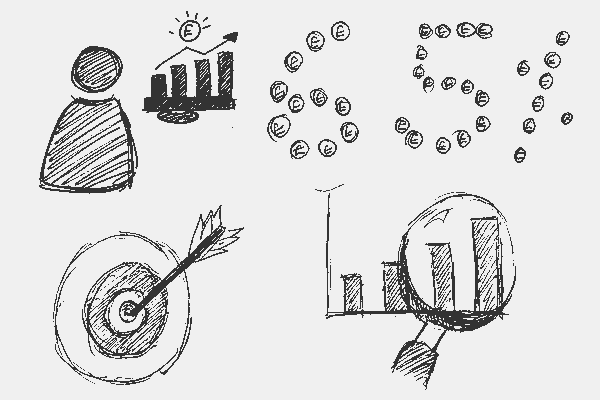
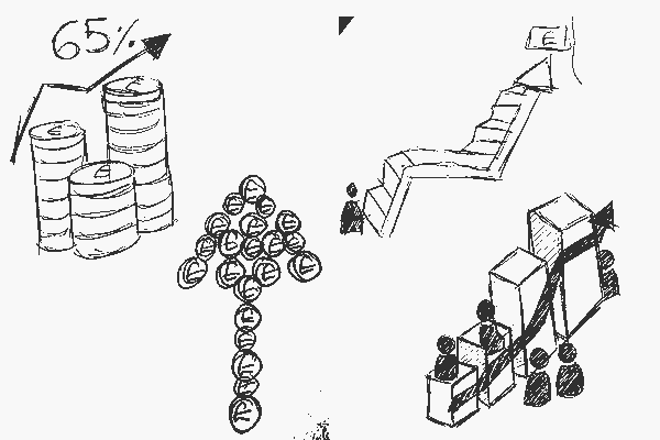
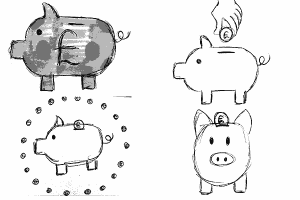
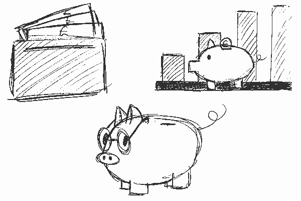
Combining all of the graphic ideation material I started to sketch ideas that best represent each graphic. I drew multiple sketches for each of the 4 graphics, all ideas were similar in nature but all slightly differ as you can see when looking through them.
The scope
Sketch feedback
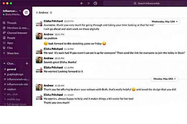
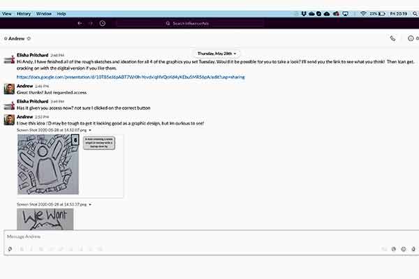
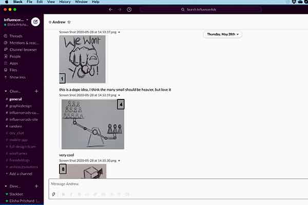
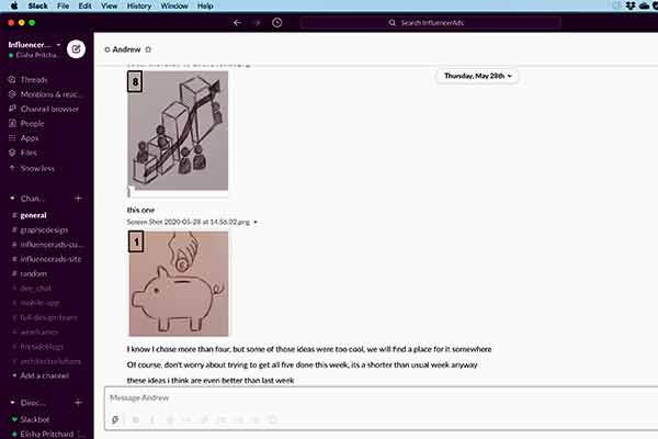
After completing the sketches I sent them to Andy, this was to determine which sketches were the best to represent each of the 4 graphics on the InfluencerAds website. (The sketches displayed in the converstaions below were the chosen sketches to take forward.)
Andy described the sketches below as the following “I love this idea :'D may be tough to get it looking good as a graphic design, but Im curious to see!” “This is a dope idea, I think the many small should be heavier, but love it.” ”I know I chose more than four, but some of those ideas were too cool, we will find a place for it somewhere.”
The scope
Graphic development
After collaborating on the final design of the graphics, I imported my sketches into Adobe Illustrator, I was ready to create my design in a digital format. For each of the 5 graphics below I have taken screenshots throughout when developing them to display how I created them.
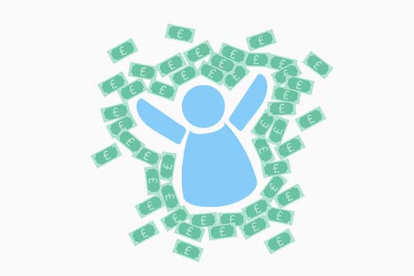
Submit your post graphic
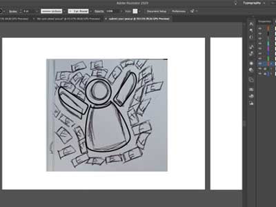
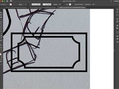
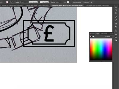
Importing the graphic into Illustrator and creating a character outline
Using the line and pen tool I create the outline of the bank notes
Using the pen tool I create the pound sign and adjusted the lines thickness
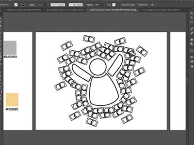
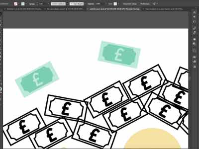
I duplicated the bank notes and spread them around the character
An exmaple of the pastel colour palette chosen for the bank notes
The scope
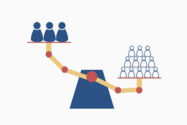
We care about the quality of the content, not the number of followers graphic
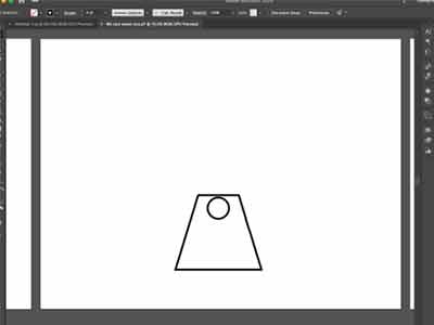
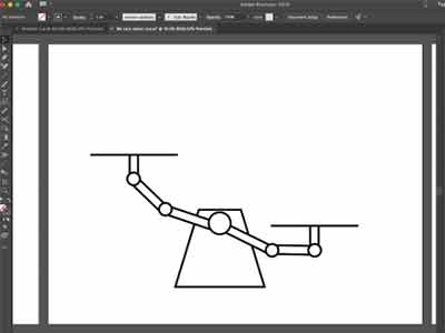
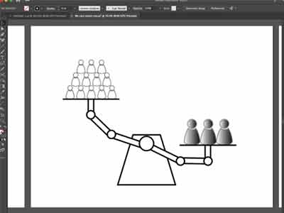
After importing the sketch I drew the base of the scales
Using the line and circle tool I create the arms of the scales
I duplicated the character graphic from the first set of web graphics and reused them
The scope
We care about the quality of the content, not the number of followers graphic
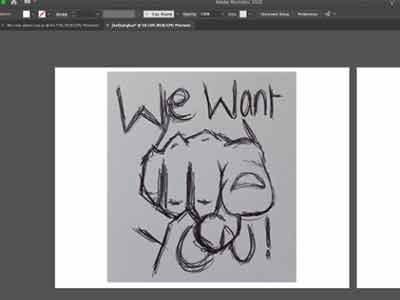
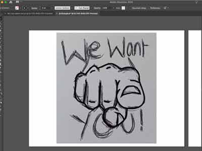
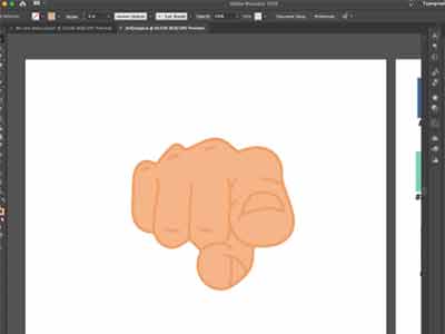
Importing the sketch into Illustrator
Tracing the outline of the sketch with the pen tool
An example of the pastel colour palette used for this graphic
The scope
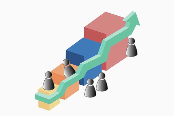
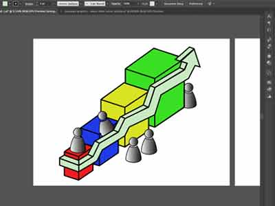
Businesses are seeing results graphic
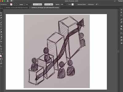
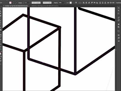
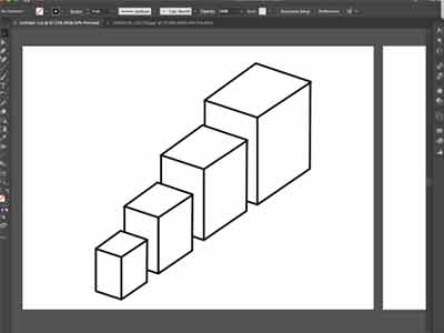
Importing the sketch into Illustrator
Here I created the 3D cube outlines and overlapped them using the line tool
I then removed the overlapping sections of the cubes
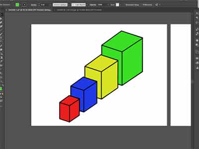
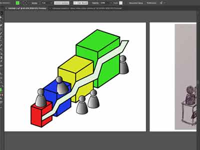
The colours used in these images are just used as place holders
Resuing the character graphic I started to build the graduating arrow
I then made the arrow 3D and curve around the cubes using the line tool
The scope
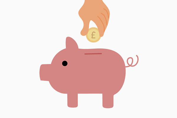
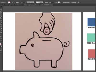
Your budget is in your hands graphic
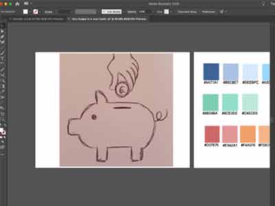
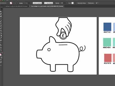
Importing the sketch into Illustrator
Creating the outline of the graphic using the pen tool
Complete graphic outline
The scope
Chosen final designs feedback
After sending all of the different colour variations for each design, Andy responded with feedback for each design: for the submit your post graphics:
- Submit your post graphic: “This one looks great, don't have any adjustments to request v. cool.”
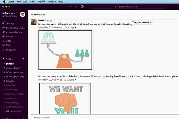
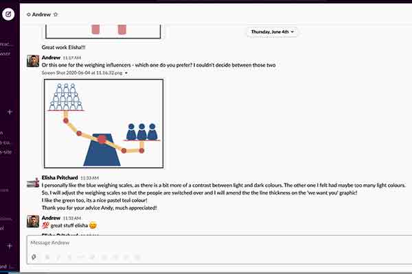
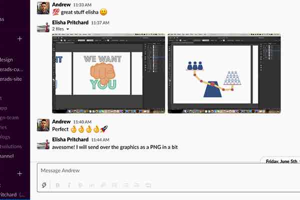
- We care about the quality of the content, not the number of followers graphic: “Can we switch which side the small people are on: so that they are heavier though.”
- We care about the quality of the content, not the number of followers graphic 2: “Can the outlines of the hand be made a bit darker, the shaping is really cool, but it is hard to distinguish the hand at first glance.”
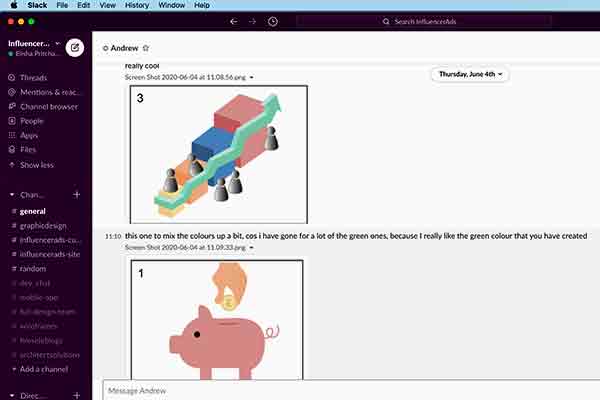
- Businesses are seeing results graphic: “Really cool.”
- Your budget is in your hands graphic: “This one to mix the colours up a bit, cos I have gone for a lot of the green ones, because I really like the green colour that you have created.”
Andy changed his mind last minute regading the colour choice for the 'We care about the quality of the content, not the number of followers graphic'. He wanted the navy blue option instead of the orange and green colour scheme.
The scope
Chosen final designs
After making all of the adjustments Andy suggested to me in the feedback, I completed all 5 graphics which can be seen displayed in the carousel below.
The scope
Task 3 (week 3-4) - Mobile app pop up ui/ux design
week 3 brief
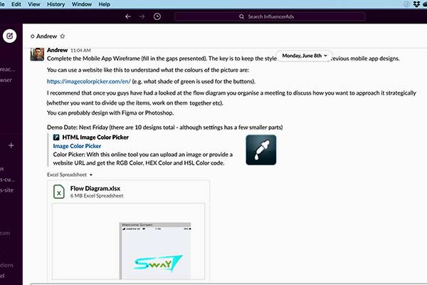
Over the next couple of weeks my task was to complete the wireframess for the InfluencerAds mobile app with a fellow graphic designer from the business.
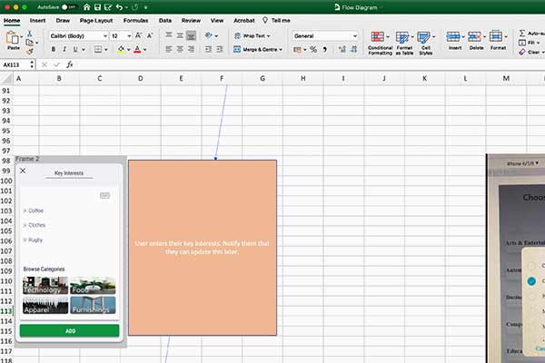
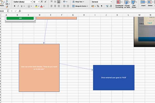
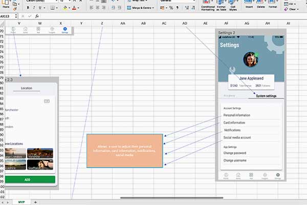
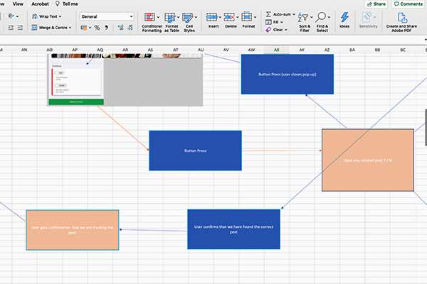
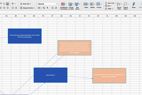
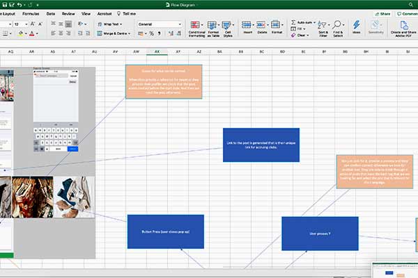
Andy stated that “The key is to keep the style consistent with the previous mobile app designs.” To which he gave examples of in a flow diagram for the app.
Another thing Andy said was “You can probably design with Figma or Photoshop.” To which I did use in the later stages of development.
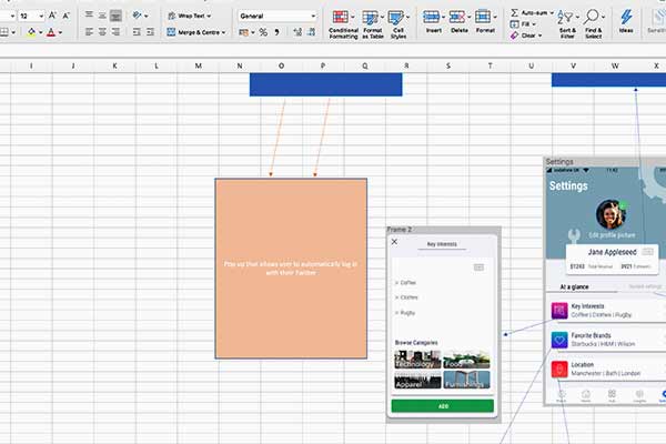
InfluencerAds mobile app flow diagram
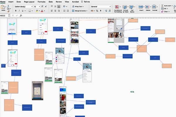
To the left is an example of the InfluencerAds flow diagram we had to work from.
Myself and the fellow designer decided to split the work load. The wireframes we had to create were in the orange boxes.
Chosen fireframes to complete
Below are enlarged screenshots of the wireframes and requirements for each of them. My colleage and I decided to take on half of these wireframes each.
The scope
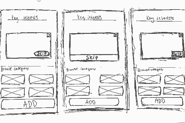
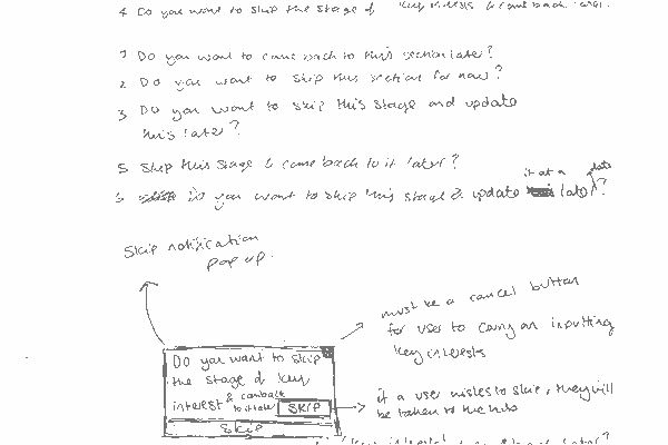
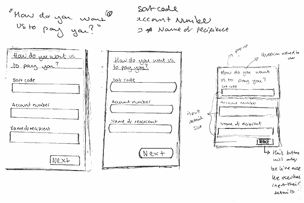
Wireframe sketches
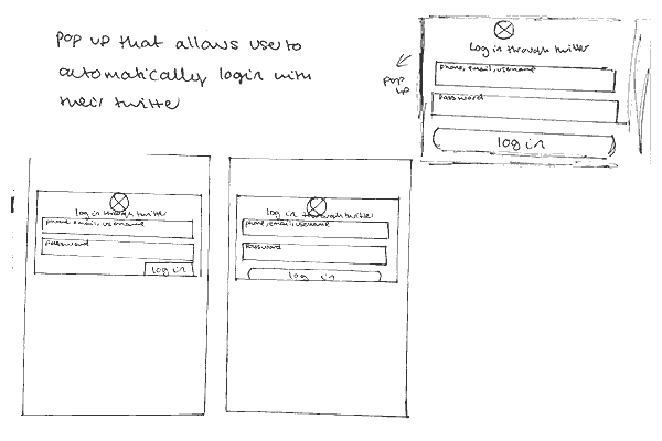
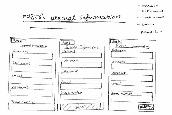
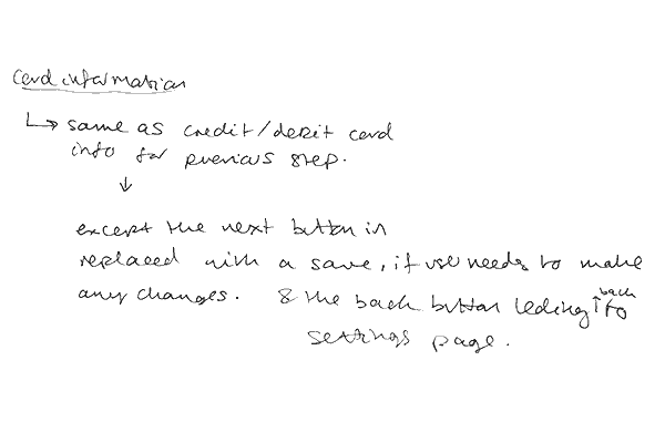
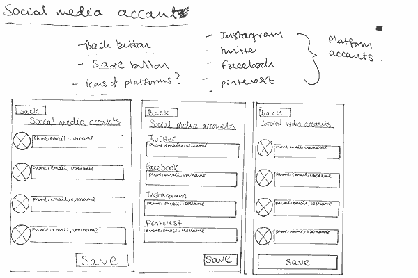
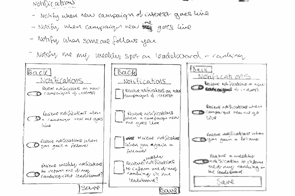
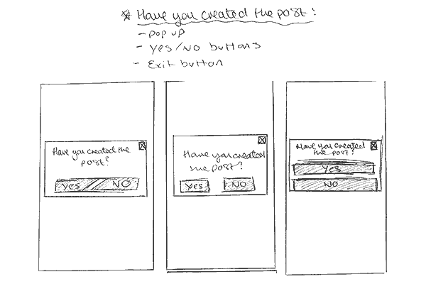
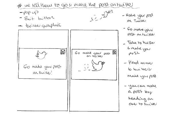
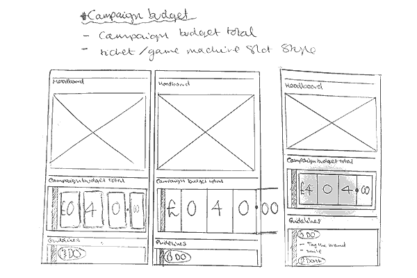
The wireframe sketches and accompanying notes for each of the wireframes I decided to take on.
The scope
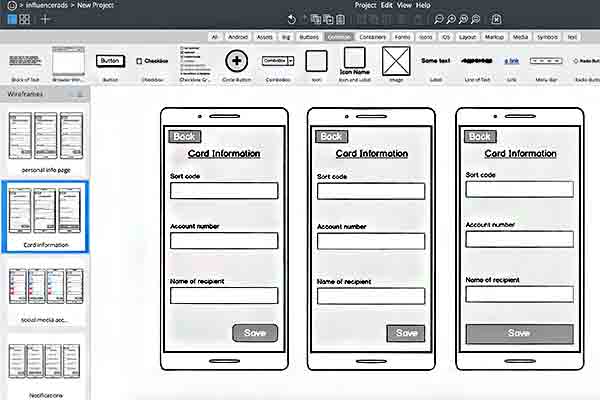
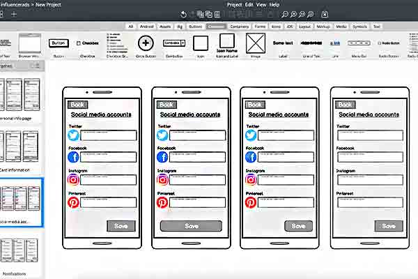
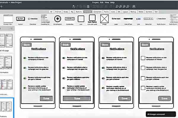
Balsamiq wireframes
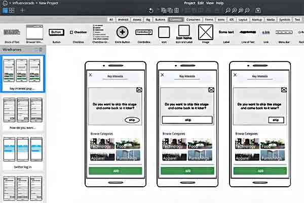
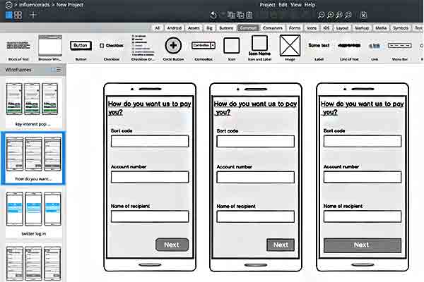
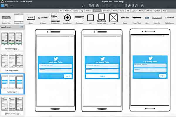
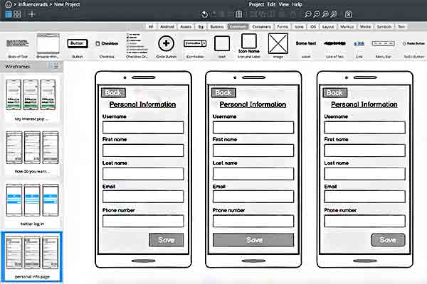
I wanted to get a rough idea as to what the wireframes would look like before I went ahead and created them in Photoshop. I wanted to do this to check if the layout and certain elements worked or not. As you can see I created a variety of 3 designs for each wireframe, this was to see what worked best together and what needed changing.
The scope
Adobe Photoshop pop-up wireframes
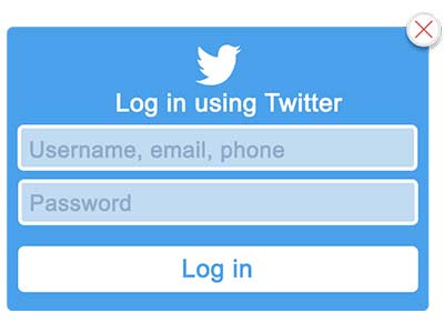
These wireframes were my first designs for this task. Majority of the elements for each wireframe was created in Photoshop, but for the twitter pop ups some were created in Illustator.
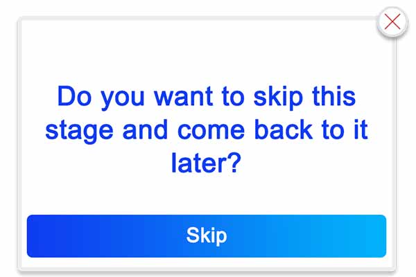
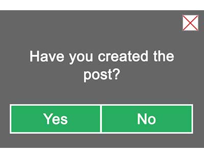
Andy orignally wanted a green and grey colour scheme for the pop ups, so this is the colour scheme I created for the 'Do you want to skip this stage and come back later?' Pop up and 'Have you created the post?' Pop up.
Twitter have their own colour scheme, so using a colour picker I used the same shade of blue for my designs as they do.
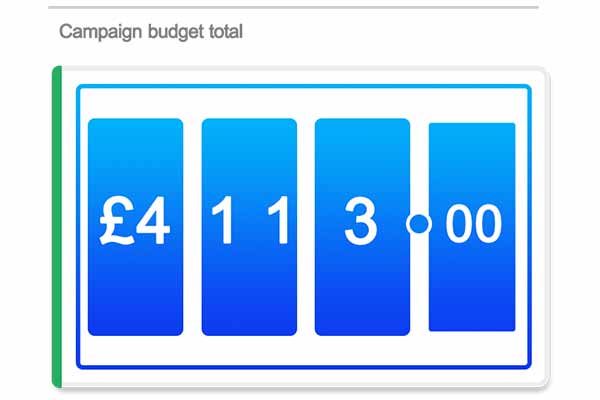
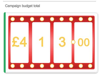
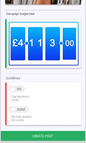
I wanted the 'Live campaign budget' pop up to look like a slot machine screen. The reasoning behind this was because I though the way the slot machine moves would be a good way that the live campaign budget could update. I wanted it to look flashy like a slot machine too, so thats why I chose a red and gold colour scheme.
The scope
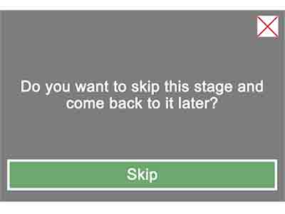
'Do you want to skip this stage and come back later?' Pop up
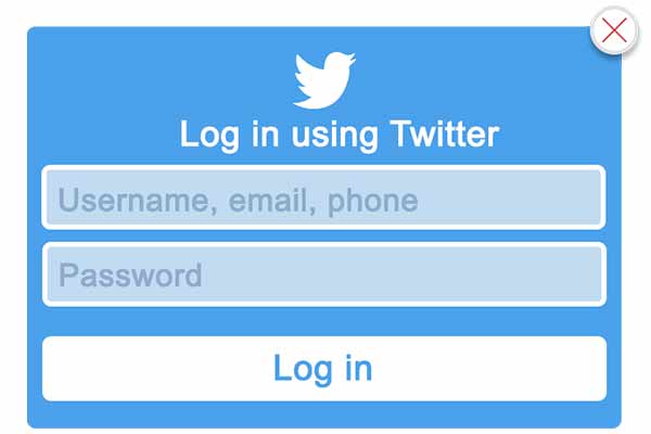
'Twitter log in' pop up
'Live campaign budget' slot machine styled pop up

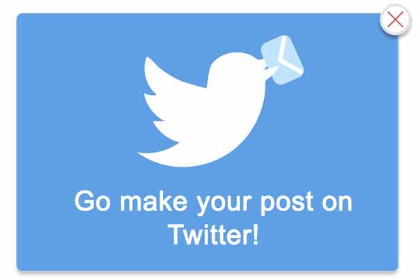
'Go make your post on Twitter' pop up
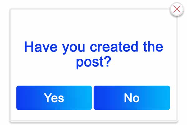
'Have you created the post?' Pop up
The scope
Wireframe assets feedback
In our weekly skype meeting, at the end of the week, I received feedback on my original wireframe pop up designs made in Adobe Photoshop.
Everyone in the meeting was over all impressed with the wireframes, I received two criticisms, one being that Andy felt that the 'Live campaign budget' wireframe colour scheme did not match the other designs. Two, being that they wanted me to try a different syle of 'escape button'. They wanted me to play around more with the form of this element.
Wireframe assets feedback
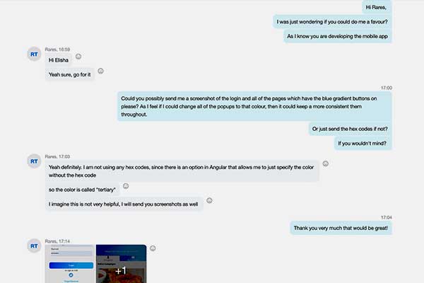
In the same meeting a developer who was also working on the mobile app demonstrated a very different colour scheme and design to myself and my fellow graphic designer.
I contacted this developer and asked him if he could screenshot the work he demonstrated in the meeting. I wanted to match my work to his, to give the mobile app a more consistent theme throughout instead of it being mismatch.
Pop up adjustments
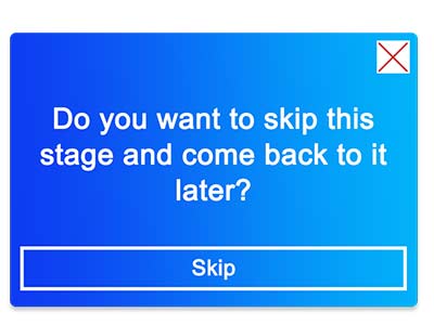
Using the feedback from the meeting, as well as the alterations I thought would benefit the design, I created two different alternative designs.
Both of the alterated designs use the same colour scheme from the screenshots my colleage sent to me.
For one of the different colour variations I changed the shape of the 'escape button' like suggested.
The scope

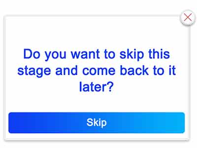
The old style 'Do you want to skip this stage and come back later?' Pop up
New variation one for 'Do you want to skip this stage and come back later?' Pop up
New variation two for 'Do you want to skip this stage and come back later?' Pop up
The scope

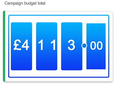
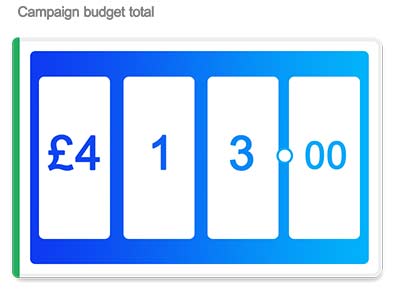
The old style 'Live campaign budget' slot machine pop up
New variation one for 'Live campaign budget' slot machine pop up
New variation two for 'Live campaign budget' slot machine pop up
The scope

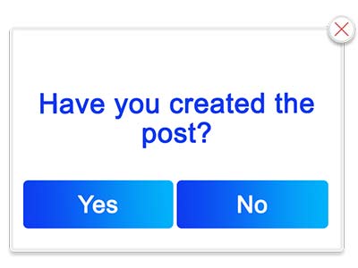
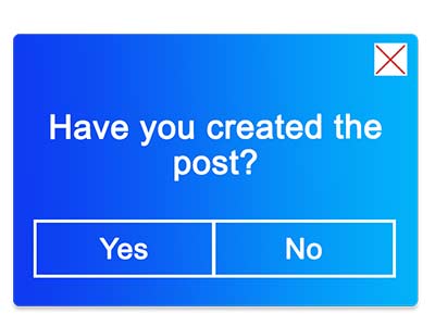
The old style 'Have you created the post?' Pop up
New variation one for 'Have you created the post?' Pop up
New variation two for 'Have you created the post?' Pop up
The scope
Pop up adjustment feedback
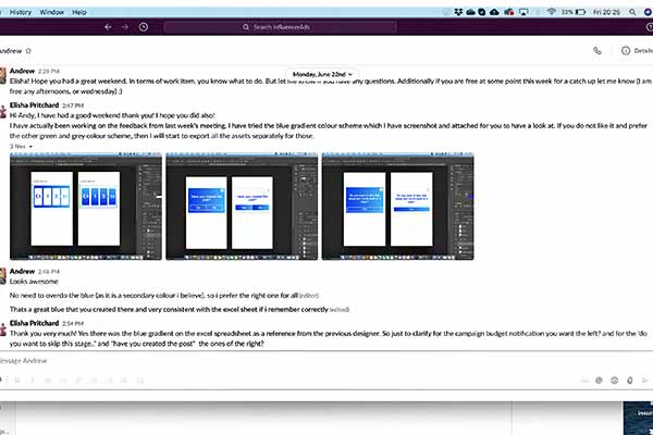
After making the adjustments I sent screenshots of the designs to Andy to get his opinion on the alterations and new colour scheme.
This was Andy's response “Looks awesome. No need to overdo the blue (as it is a secondary colour I believe), so I prefer the right one for all. Thats a great blue that you created there and very consistent with the excel sheet if I remember correctly.”
Final pop ups
The scope
Final pop up file type
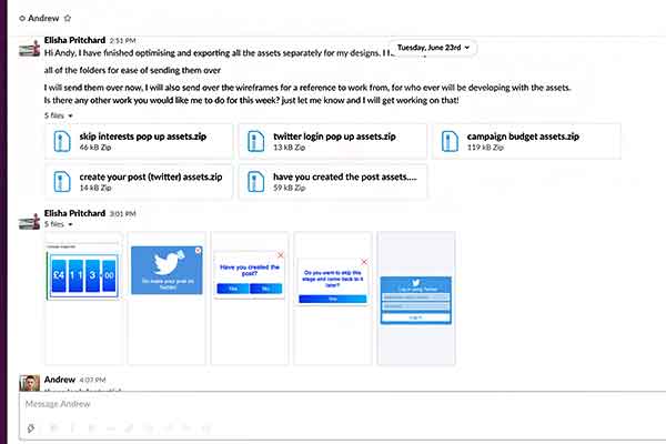
I exported all of the elements and assets within each wireframe seperately and put them all in compressed zip folders. I repeated this process for each wireframe, doing this made the file sizing smaller allowing them to be sent over easier.
I did this so that the developers could build the pop up into their code ready to use for the mobile app.
Task 4 (week 5) - Mobile app concept pop up ui/ux
The brief
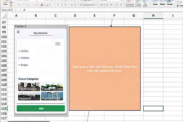
At the begining of that week is our skype call I was assigned the task of creating concept pieces for the wireframes I had created the previous week.
I was asked to do this as it would help them get a feel of what the wireframes would look like when a cutsomer would be interacting with them in the mobile app.
Examples of the page layout the wireframe would be on was given to me in the excel spread sheet used in the previous weeks.
The scope
Final design mobile app concept pieces
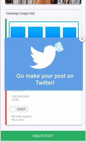
This was a very small task to be completed in a week, as I already had all of the material required to assembled the concept pieces. I created all of the concept pieces displayed below in Adobe Photoshop. All of the wireframes are pop ups that would be displayed on a users screen, I wanted to bring the pop ups to the users attention and applied a faint drop shadow to do this.
The scope
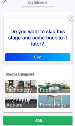
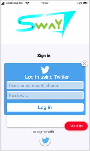
'Do you want to skip this stage and come back later?' concept piece
'Sign in through twitter' concept piece
'Live campaign budget' concept piece
The scope
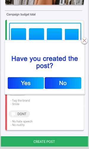
'Have you created the post?' concept piece
'Go make your post on Twitter' concept piece
The scope
Feedback
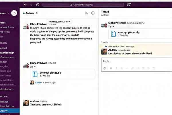
Like with the pop ups, I compressed the images and put them all into a zip file before sending them over to Andy for feedback.
After sending the zip folder to Andy I received positive feedback “I just looked at these, absolutely brilliant!” I had no alterations to make which concluded the work for that week.
The scope
Task 5 (week 6) - cartoon promotional video
Brief
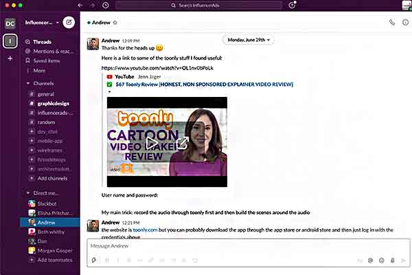
This weeks task was to create a promotional based animation for the InfluencerAds website and their social media, this was to help spread their business' beliefs to their customers.
In order to create this I had to learn to use an animation based program called Toonly. Andy gave me the business' login credentials as well as tutorial videos to help me familiarise myself with the program.
The script
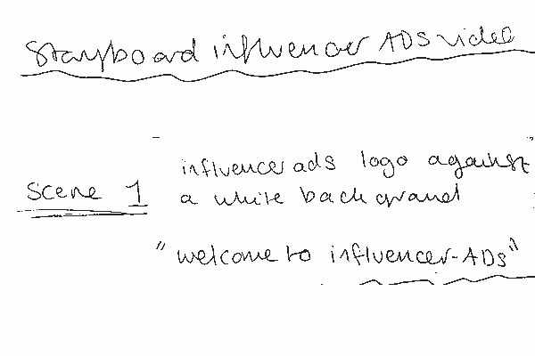
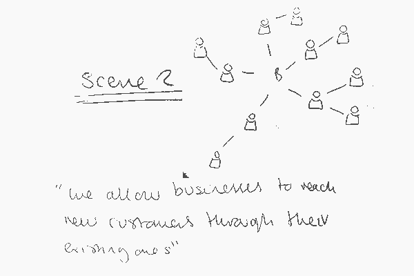
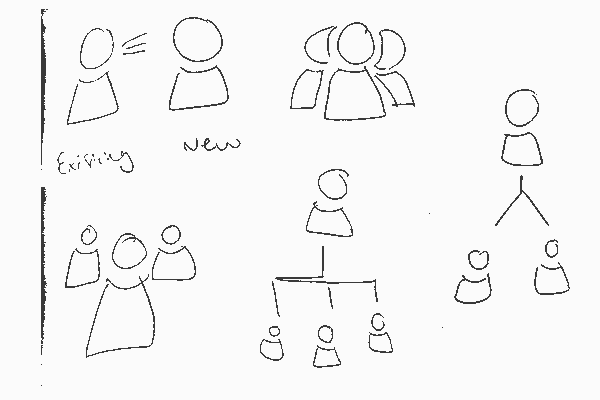
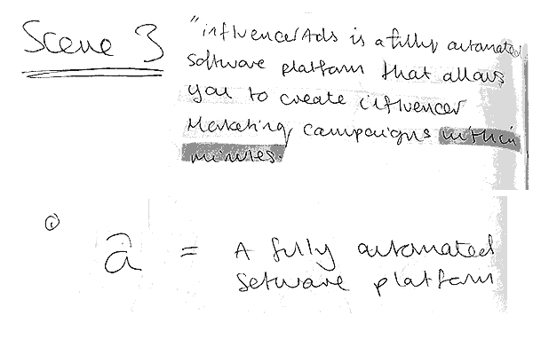
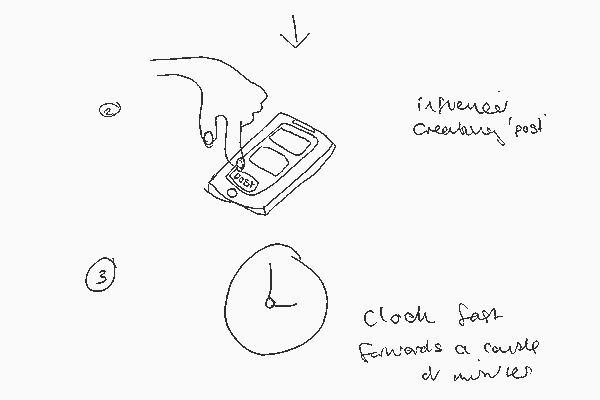
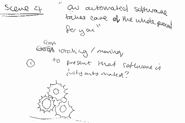
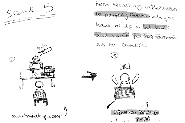
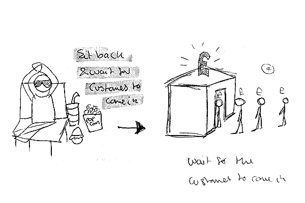
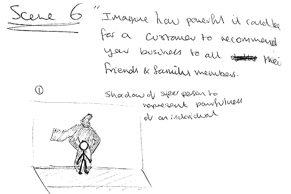
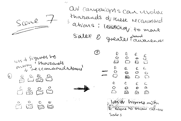
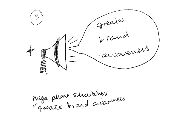
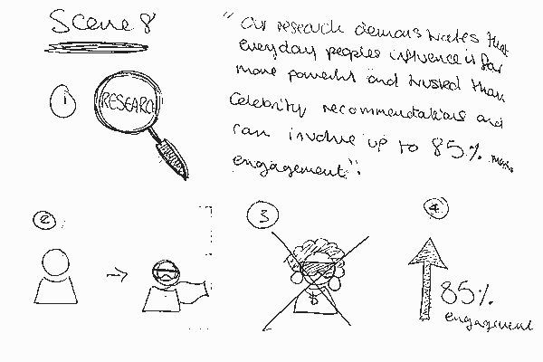
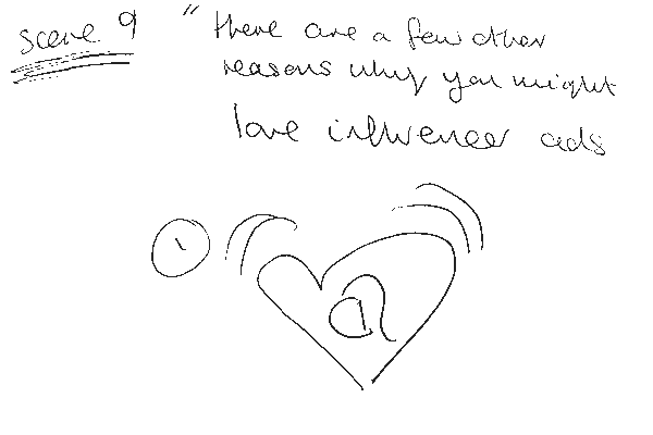
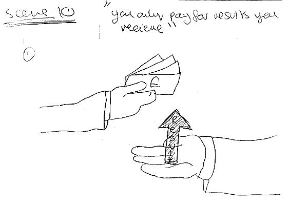
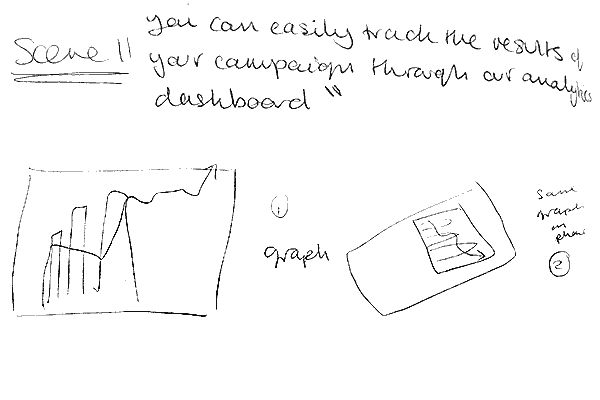
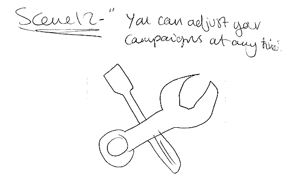
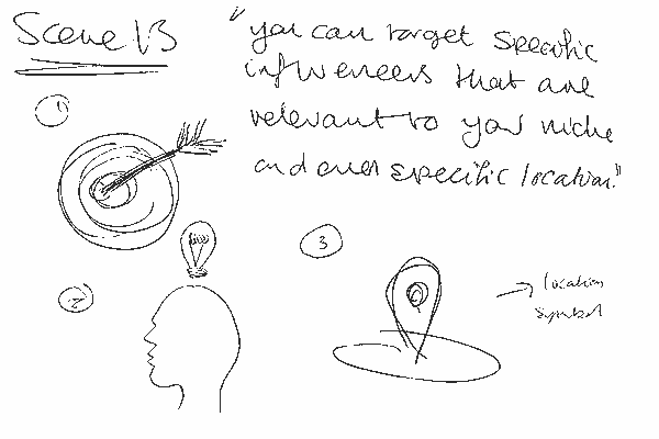
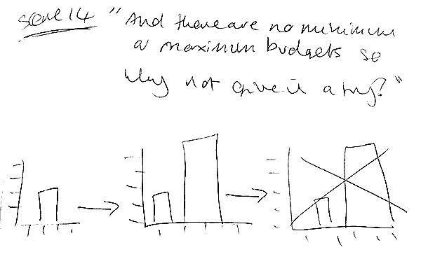
After familiarising myself with the program, as well as the script, I started to story board the different possible scenes for the promotional video.
After completing the sketches I sent them to Andy, this was to determine which sketches were the best to represent each of the 4 graphics on the InfluencerAds website. (The sketches displayed in the converstaions below were the chosen sketches to take forward.)
Andy described the sketches below as the following “I love this idea :'D may be tough to get it looking good as a graphic design, but Im curious to see!” “This is a dope idea, I think the many small should be heavier, but love it.” ”I know I chose more than four, but some of those ideas were too cool, we will find a place for it somewhere.”
The scope
Graphic development
After collaborating on the final design of the graphics, I imported my sketches into Adobe Illustrator, I was ready to create my design in a digital format. For each of the 5 graphics below I have taken screenshots throughout when developing them to display how I created them.
Submit your post graphic


Importing the graphic into Illustrator and creating a character outline
Using the line and pen tool I create the outline of the bank notes
Using the pen tool I create the pound sign and adjusted the lines thickness


I duplicated the bank notes and spread them around the character
An exmaple of the pastel colour palette chosen for the bank notes
The scope
We care about the quality of the content, not the number of followers graphic


After importing the sketch I drew the base of the scales
Using the line and circle tool I create the arms of the scales
I duplicated the character graphic from the first set of web graphics and reused them
The scope
We care about the quality of the content, not the number of followers graphic


Importing the sketch into Illustrator
Tracing the outline of the sketch with the pen tool
An example of the pastel colour palette used for this graphic
The scope
Businesses are seeing results graphic


Importing the sketch into Illustrator
Here I created the 3D cube outlines and overlapped them using the line tool
I then removed the overlapping sections of the cubes


The colours used in these images are just used as place holders
Resuing the character graphic I started to build the graduating arrow
I then made the arrow 3D and curve around the cubes using the line tool
The scope
Your budget is in your hands graphic


Importing the sketch into Illustrator
Creating the outline of the graphic using the pen tool
Complete graphic outline
The scope
Chosen final designs feedback
After sending all of the different colour variations for each design, Andy responded with feedback for each design: for the submit your post graphics:
- Submit your post graphic: “This one looks great, don't have any adjustments to request v. cool.”
- We care about the quality of the content, not the number of followers graphic: “Can we switch which side the small people are on: so that they are heavier though.”
- We care about the quality of the content, not the number of followers graphic 2: “Can the outlines of the hand be made a bit darker, the shaping is really cool, but it is hard to distinguish the hand at first glance.”
- Businesses are seeing results graphic: “Really cool.”
- Your budget is in your hands graphic: “This one to mix the colours up a bit, cos I have gone for a lot of the green ones, because I really like the green colour that you have created.”
Andy changed his mind last minute regading the colour choice for the 'We care about the quality of the content, not the number of followers graphic'. He wanted the navy blue option instead of the orange and green colour scheme.
The scope
Chosen final designs
After making all of the adjustments Andy suggested to me in the feedback, I completed all 5 graphics which can be seen displayed in the carousel below.
The scope
Task 3 (week 3-4) - Mobile app pop up ui/ux design
week 3 brief

Over the next couple of weeks my task was to complete the wireframess for the InfluencerAds mobile app with a fellow graphic designer from the business.
Andy stated that “The key is to keep the style consistent with the previous mobile app designs.” To which he gave examples of in a flow diagram for the app.
Another thing Andy said was “You can probably design with Figma or Photoshop.” To which I did use in the later stages of development.
InfluencerAds mobile app flow diagram

To the left is an example of the InfluencerAds flow diagram we had to work from.
Myself and the fellow designer decided to split the work load. The wireframes we had to create were in the orange boxes.
Chosen fireframes to complete
Below are enlarged screenshots of the wireframes and requirements for each of them. My colleage and I decided to take on half of these wireframes each.
The scope
Wireframe sketches
The wireframe sketches and accompanying notes for each of the wireframes I decided to take on.
The scope
Balsamiq wireframes
I wanted to get a rough idea as to what the wireframes would look like before I went ahead and created them in Photoshop. I wanted to do this to check if the layout and certain elements worked or not. As you can see I created a variety of 3 designs for each wireframe, this was to see what worked best together and what needed changing.
The scope
Adobe Photoshop pop-up wireframes
These wireframes were my first designs for this task. Majority of the elements for each wireframe was created in Photoshop, but for the twitter pop ups some were created in Illustator.
Andy orignally wanted a green and grey colour scheme for the pop ups, so this is the colour scheme I created for the 'Do you want to skip this stage and come back later?' Pop up and 'Have you created the post?' Pop up.
Twitter have their own colour scheme, so using a colour picker I used the same shade of blue for my designs as they do.
I wanted the 'Live campaign budget' pop up to look like a slot machine screen. The reasoning behind this was because I though the way the slot machine moves would be a good way that the live campaign budget could update. I wanted it to look flashy like a slot machine too, so thats why I chose a red and gold colour scheme.
The scope


'Do you want to skip this stage and come back later?' Pop up
'Twitter log in' pop up
'Live campaign budget' slot machine styled pop up


'Go make your post on Twitter' pop up
'Have you created the post?' Pop up
The scope
Wireframe assets feedback

In our weekly skype meeting, at the end of the week, I received feedback on my original wireframe pop up designs made in Adobe Photoshop.
Everyone in the meeting was over all impressed with the wireframes, I received two criticisms, one being that Andy felt that the 'Live campaign budget' wireframe colour scheme did not match the other designs. Two, being that they wanted me to try a different syle of 'escape button'. They wanted me to play around more with the form of this element.
Wireframe assets feedback

In the same meeting a developer who was also working on the mobile app demonstrated a very different colour scheme and design to myself and my fellow graphic designer.
I contacted this developer and asked him if he could screenshot the work he demonstrated in the meeting. I wanted to match my work to his, to give the mobile app a more consistent theme throughout instead of it being mismatch.
Pop up adjustments
Using the feedback from the meeting, as well as the alterations I thought would benefit the design, I created two different alternative designs.
Both of the alterated designs use the same colour scheme from the screenshots my colleage sent to me.
For one of the different colour variations I changed the shape of the 'escape button' like suggested.
The scope


The old style 'Do you want to skip this stage and come back later?' Pop up
New variation one for 'Do you want to skip this stage and come back later?' Pop up
New variation two for 'Do you want to skip this stage and come back later?' Pop up
The scope


The old style 'Live campaign budget' slot machine pop up
New variation one for 'Live campaign budget' slot machine pop up
New variation two for 'Live campaign budget' slot machine pop up
The scope


The old style 'Have you created the post?' Pop up
New variation one for 'Have you created the post?' Pop up
New variation two for 'Have you created the post?' Pop up
The scope
Pop up adjustment feedback

After making the adjustments I sent screenshots of the designs to Andy to get his opinion on the alterations and new colour scheme.
This was Andy's response “Looks awesome. No need to overdo the blue (as it is a secondary colour I believe), so I prefer the right one for all. Thats a great blue that you created there and very consistent with the excel sheet if I remember correctly.”
Final pop ups
The scope
Final pop up file type

I exported all of the elements and assets within each wireframe seperately and put them all in compressed zip folders. I repeated this process for each wireframe, doing this made the file sizing smaller allowing them to be sent over easier.
I did this so that the developers could build the pop up into their code ready to use for the mobile app.
Task 4 (week 5) - Mobile app concept pop up ui/ux
The brief
At the begining of that week is our skype call I was assigned the task of creating concept pieces for the wireframes I had created the previous week.
I was asked to do this as it would help them get a feel of what the wireframes would look like when a cutsomer would be interacting with them in the mobile app.
Examples of the page layout the wireframe would be on was given to me in the excel spread sheet used in the previous weeks.
The scope
Final design mobile app concept pieces
This was a very small task to be completed in a week, as I already had all of the material required to assembled the concept pieces. I created all of the concept pieces displayed below in Adobe Photoshop. All of the wireframes are pop ups that would be displayed on a users screen, I wanted to bring the pop ups to the users attention and applied a faint drop shadow to do this.
The scope


'Do you want to skip this stage and come back later?' concept piece
'Sign in through twitter' concept piece
'Live campaign budget' concept piece
The scope


'Have you created the post?' concept piece
'Go make your post on Twitter' concept piece
The scope
Feedback

Like with the pop ups, I compressed the images and put them all into a zip file before sending them over to Andy for feedback.
After sending the zip folder to Andy I received positive feedback “I just looked at these, absolutely brilliant!” I had no alterations to make which concluded the work for that week.
The scope
Task 5 (week 6) - cartoon promotional video
Brief

This weeks task was to create a promotional based animation for the InfluencerAds website and their social media, this was to help spread their business' beliefs to their customers.
In order to create this I had to learn to use an animation based program called Toonly. Andy gave me the business' login credentials as well as tutorial videos to help me familiarise myself with the program.
The script
After familiarising myself with the program, as well as the script, I started to story board the different possible scenes for the promotional video.
