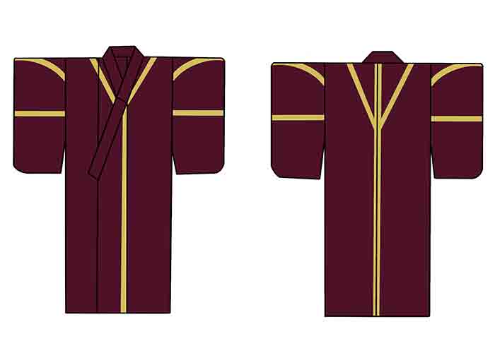
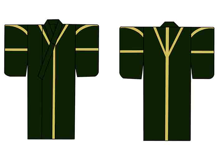
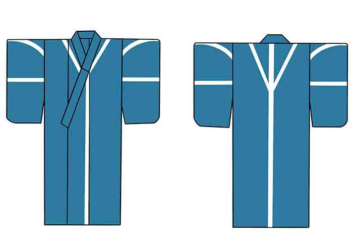
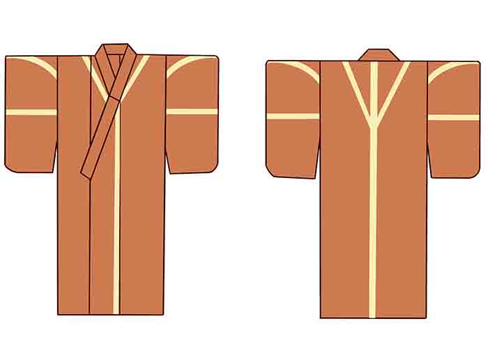
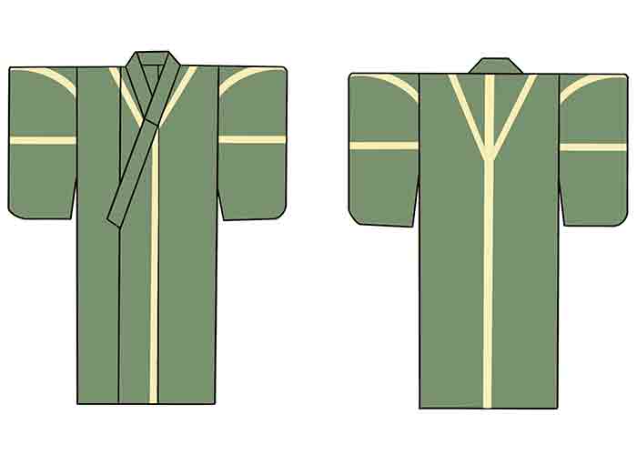
Unlike, with the main characters, I did not want these characters or their garments to stand out. The look of their garments should be simple in style, colour and patterns to reflect their stature.
I decided that the colour palettes should either be dull or dark and the pattern to be minimal.
I looked at the visual research I had previously conducted, and came to this first pattern and colour design for the female servants kimono below.
After creating the first pattern, I felt that this pattern did not reflect the household that the servants belonged to, therefore I changed the first pattern to the Adachi family pattern.
Wearing the pattern of such a prestigous household should give the wearer a sense of pride.
I kept the colours of the kimono the same, but knew I wanted to cut the colours down to three at a later stage.
I thought about how I could make it even more noticeable that these individuals belonged to the Adachi houehold.
One of my ideas was to have a label embroidered to the back of the kimono, with the Adachi name on it. I felt that the idea and concept was good, but after visually seeing my idea come into materialisation, it was too much. It overpowered the whole kimono design, so I decided that keeping the design simple was best.
I cut down the colour choice of the kimono from 5 to 3 and kept the Adachi family pattern on all three of the final chosen coloured kimono.
Each coloured kimono signifies a job role that an individual carries out:
Blue kimono - Directly serves the master of the residence
Orange kimono - Carries out household chores like cleaning, cooking and laundry
Green kimono - Tends to agriculture, gathering materials, collects food and water